An appetising identity system for an organic honey and preserves brand
THE SITUATION
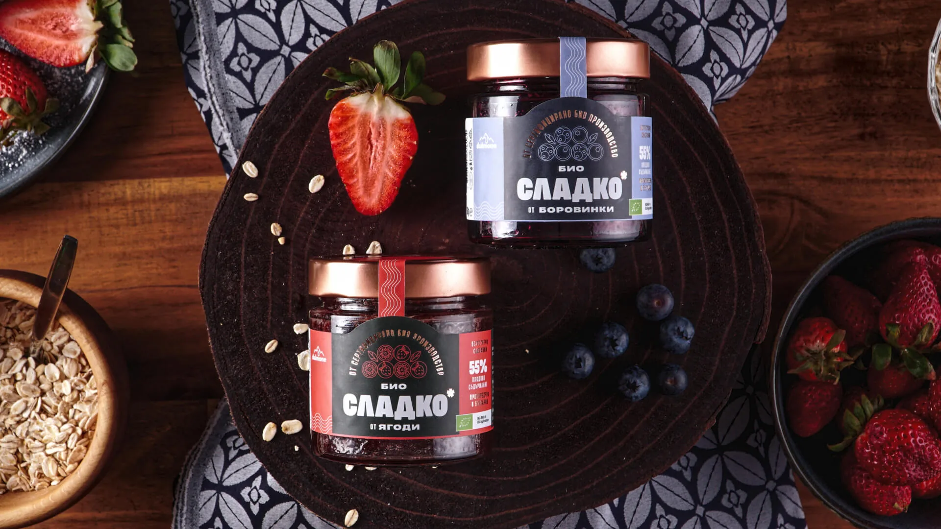
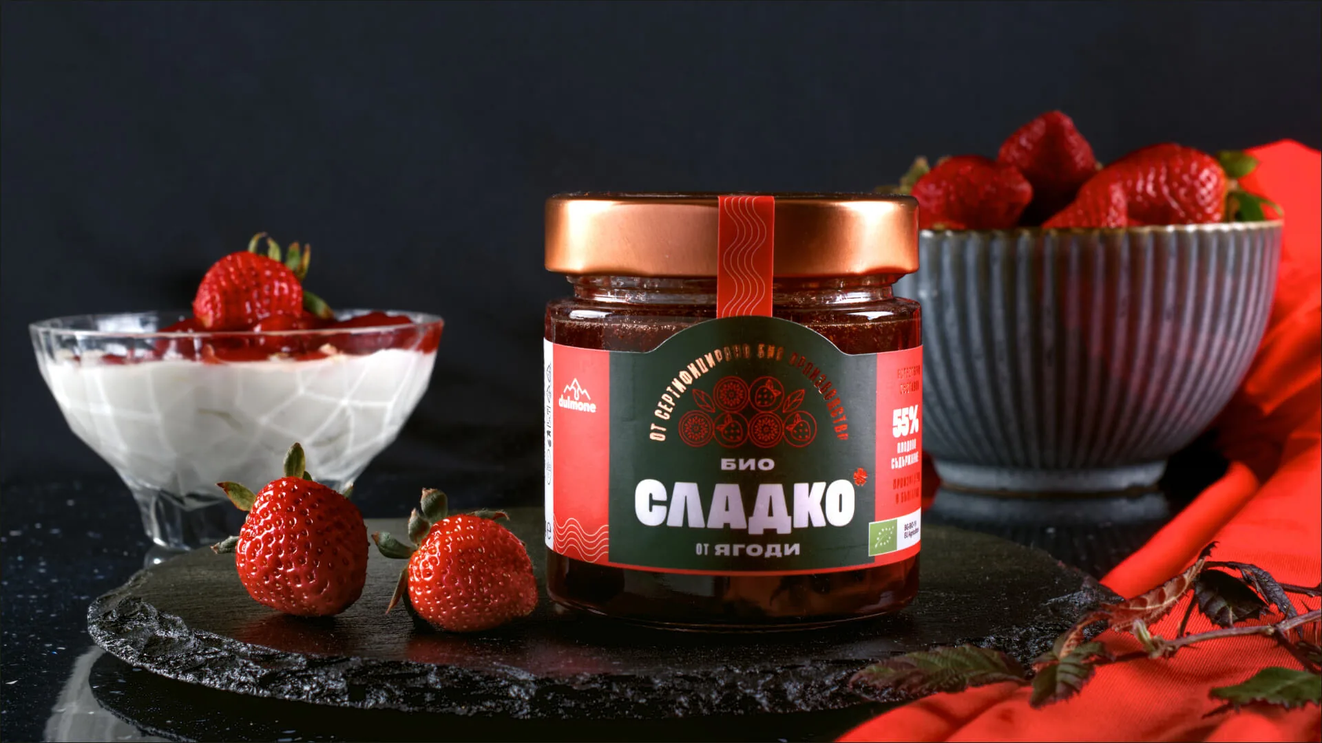
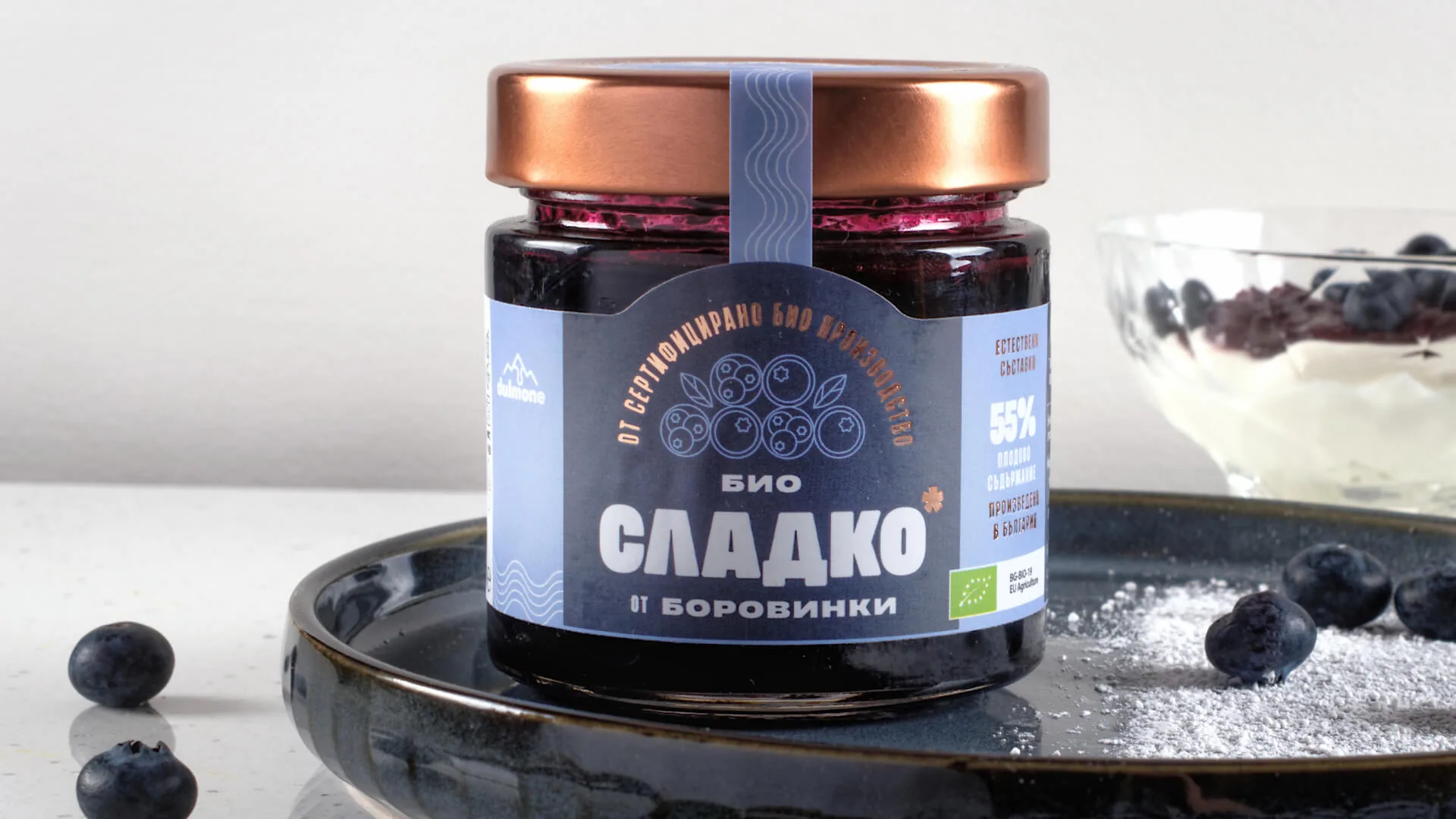
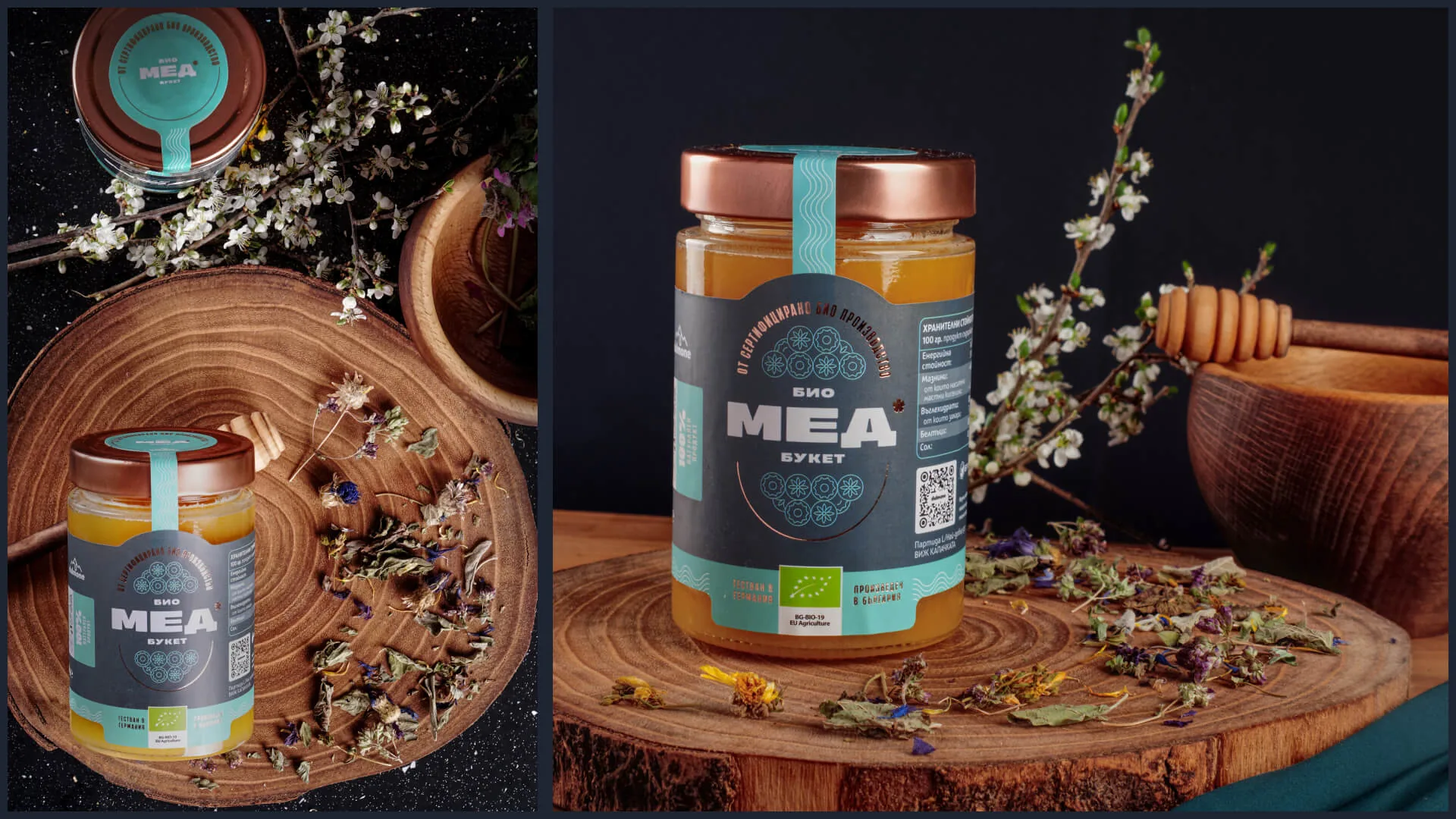
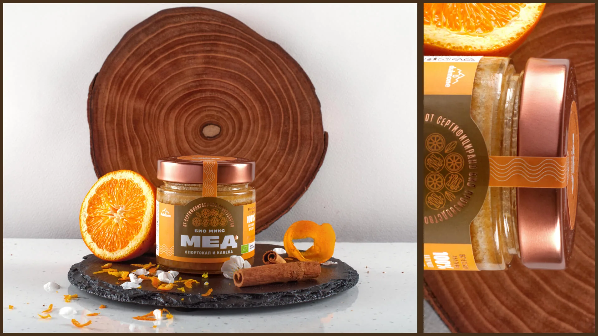
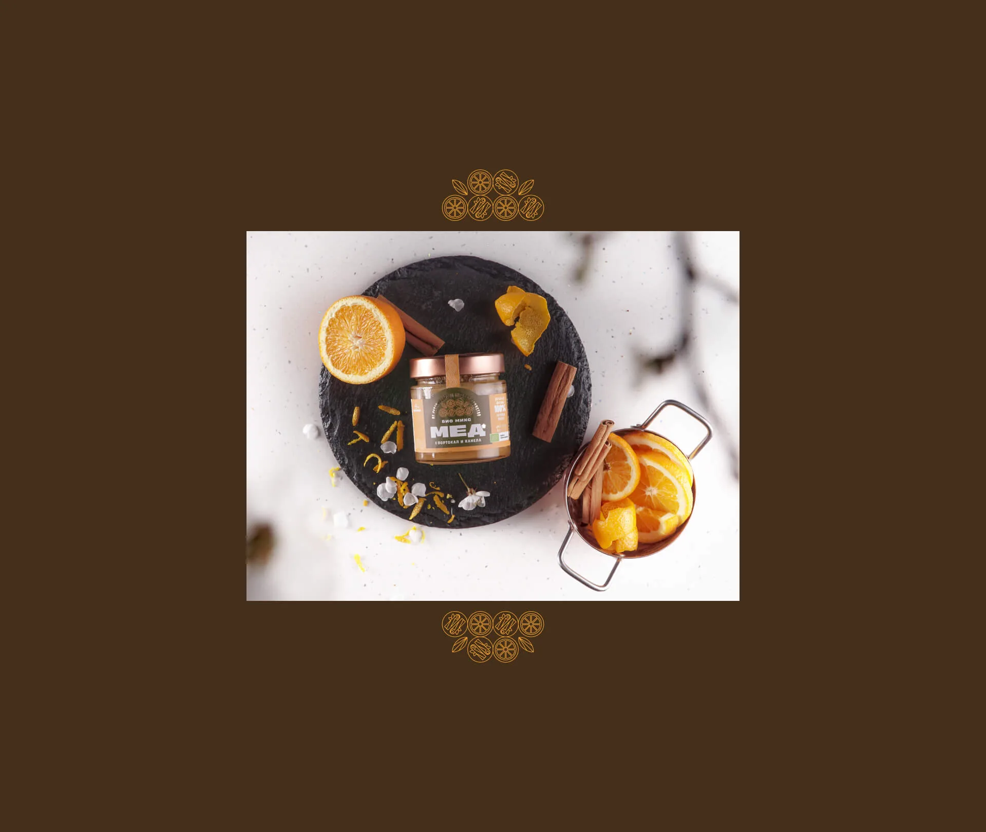
Dulmone is BG Hive's organic honey and preserves brand from Plovdiv. In a category full of identical jars, the brand wanted to look as appetising and as unusual as the product itself tastes.
WHAT WE DID
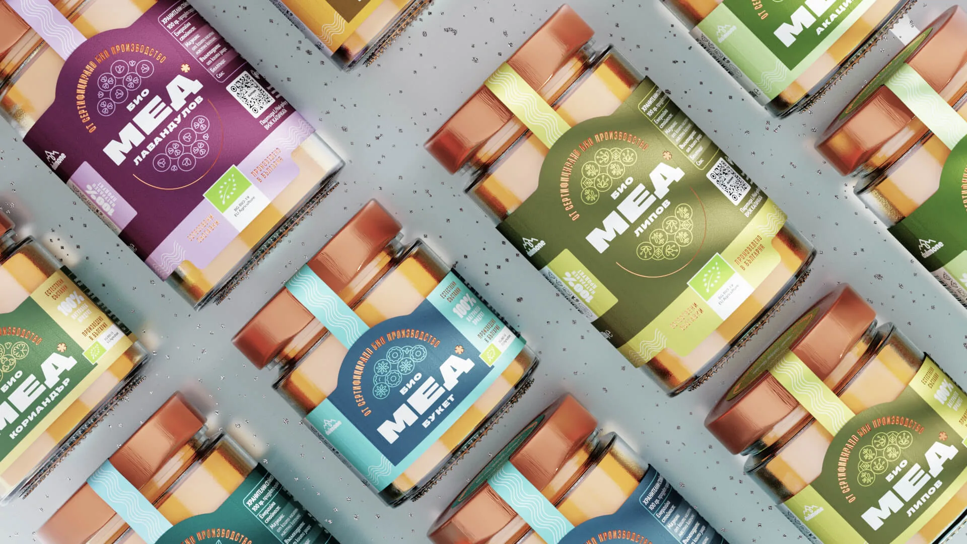
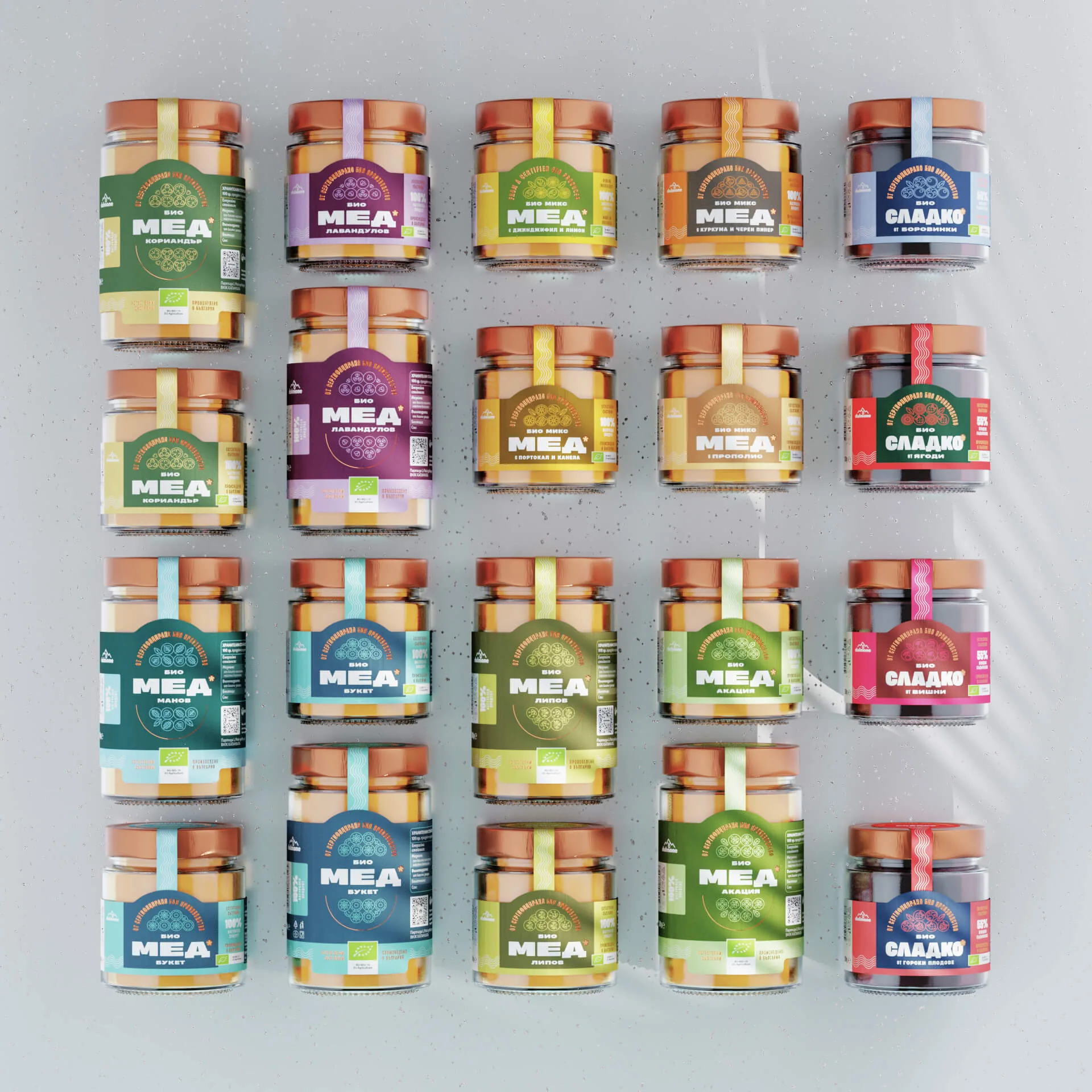
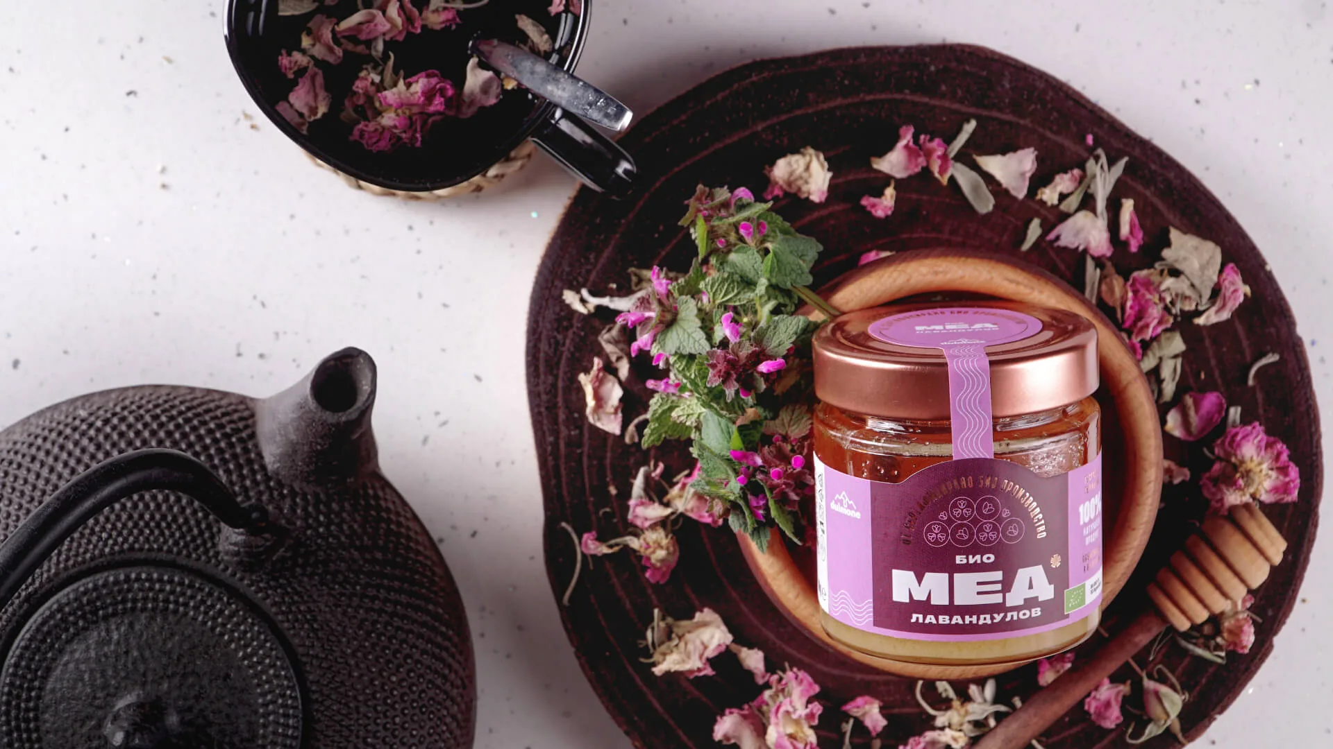
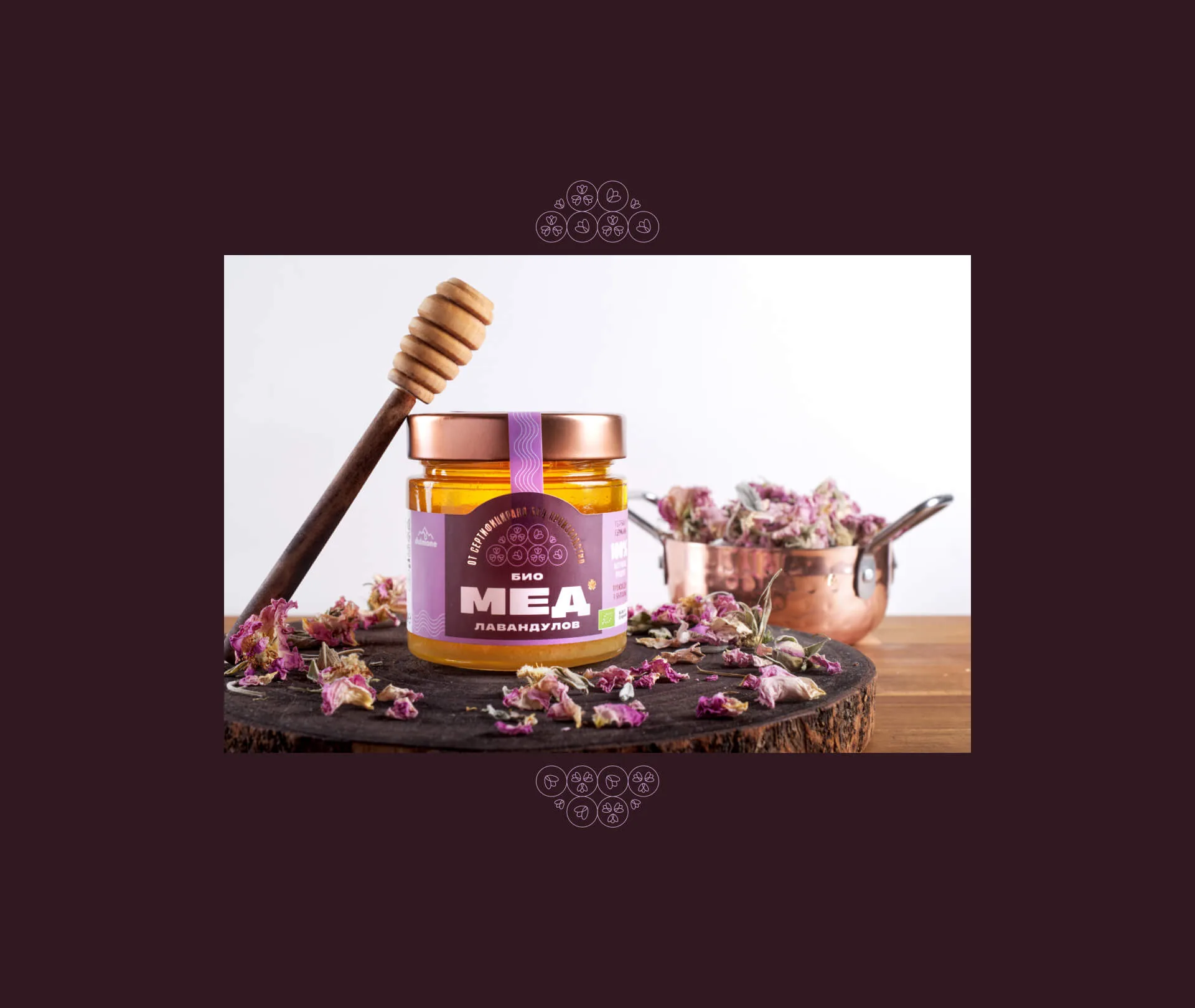
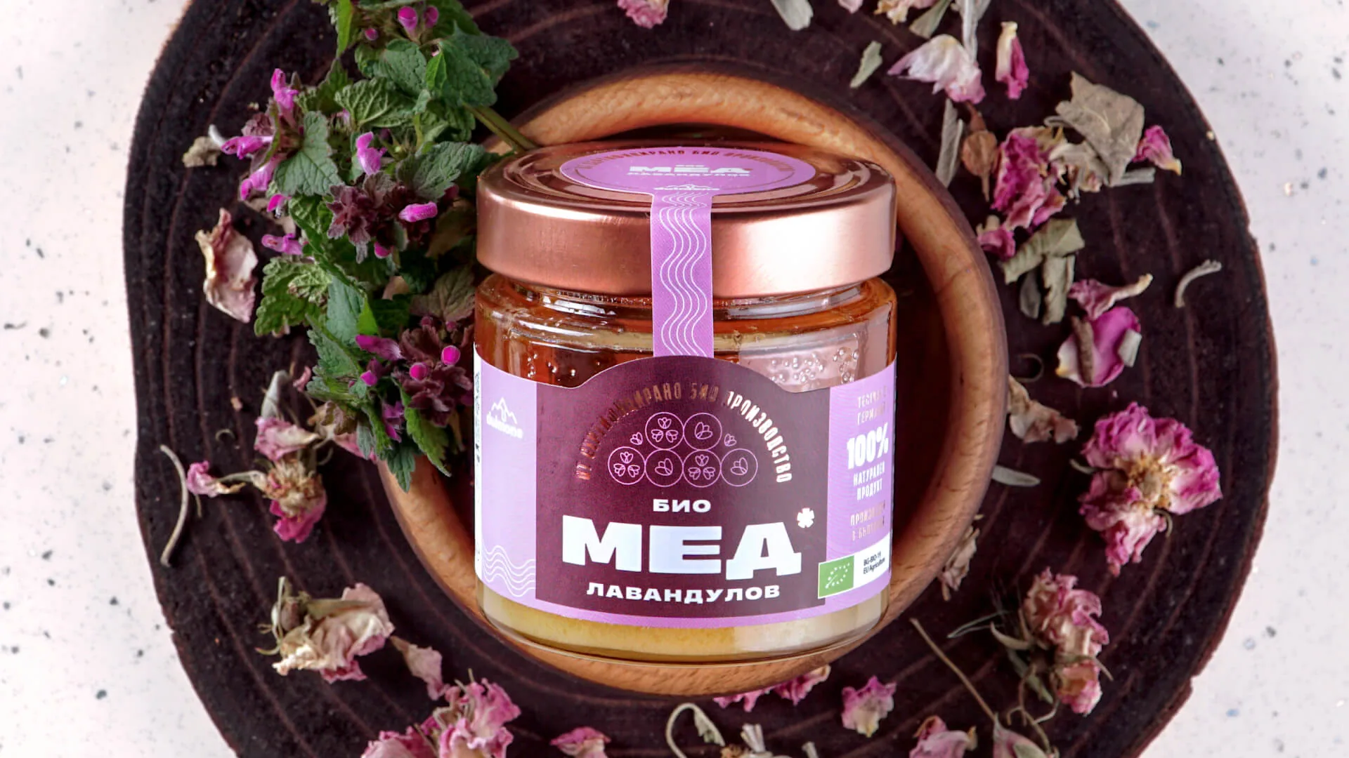
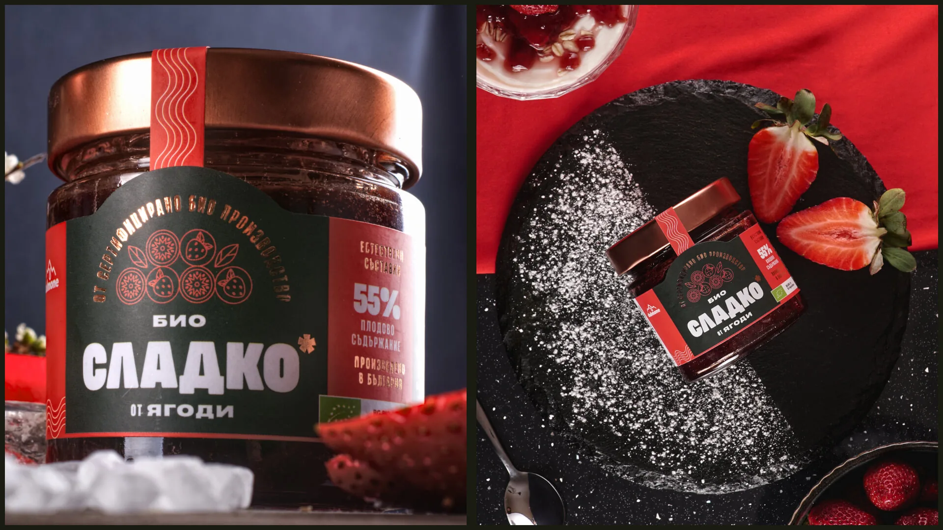
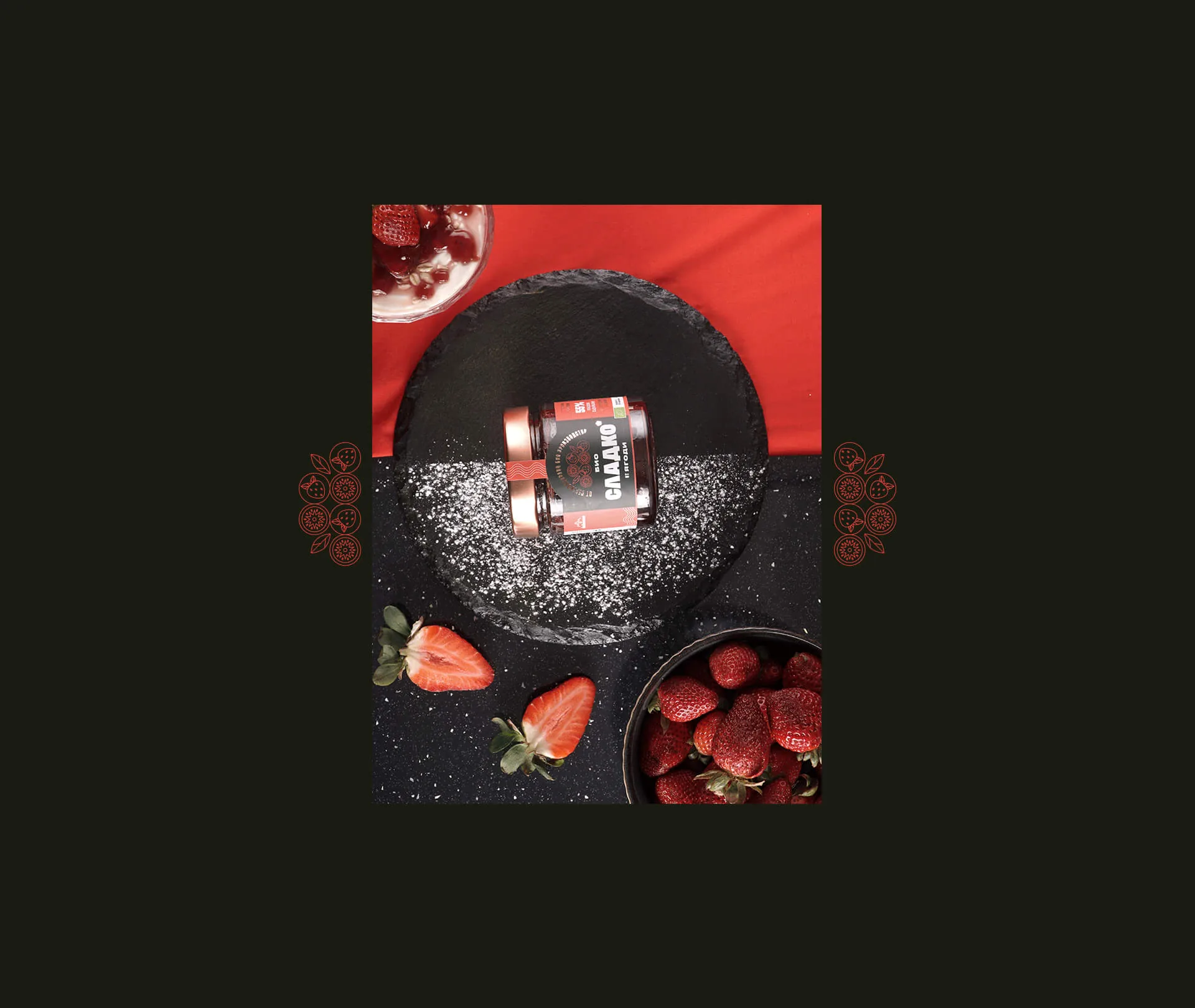
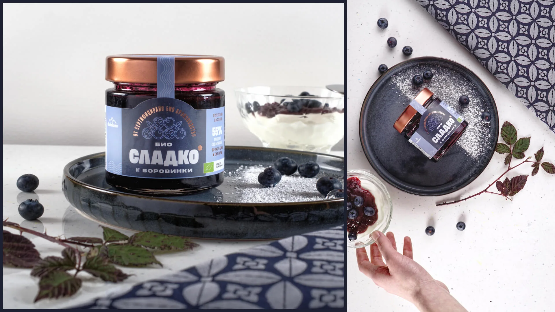
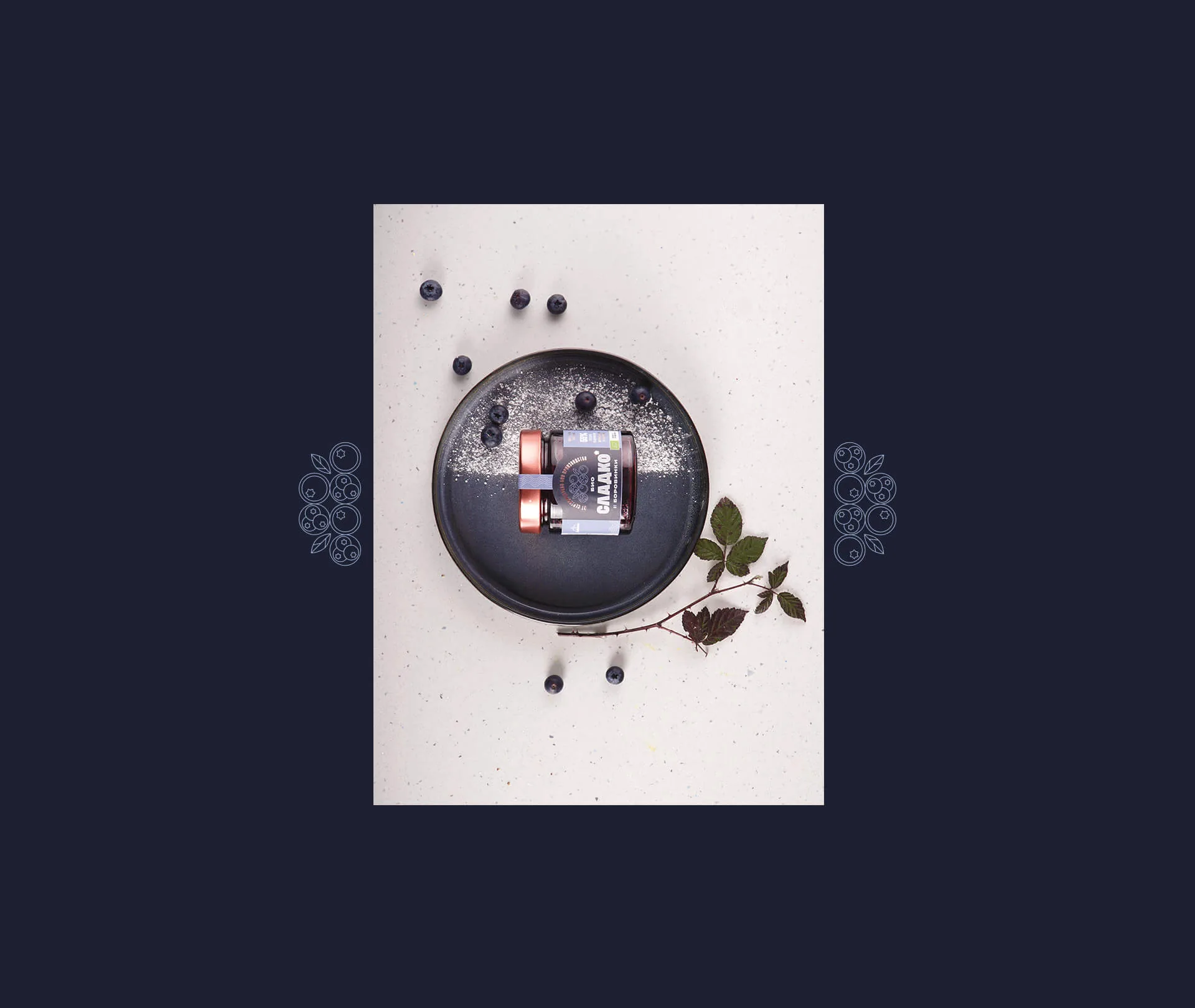
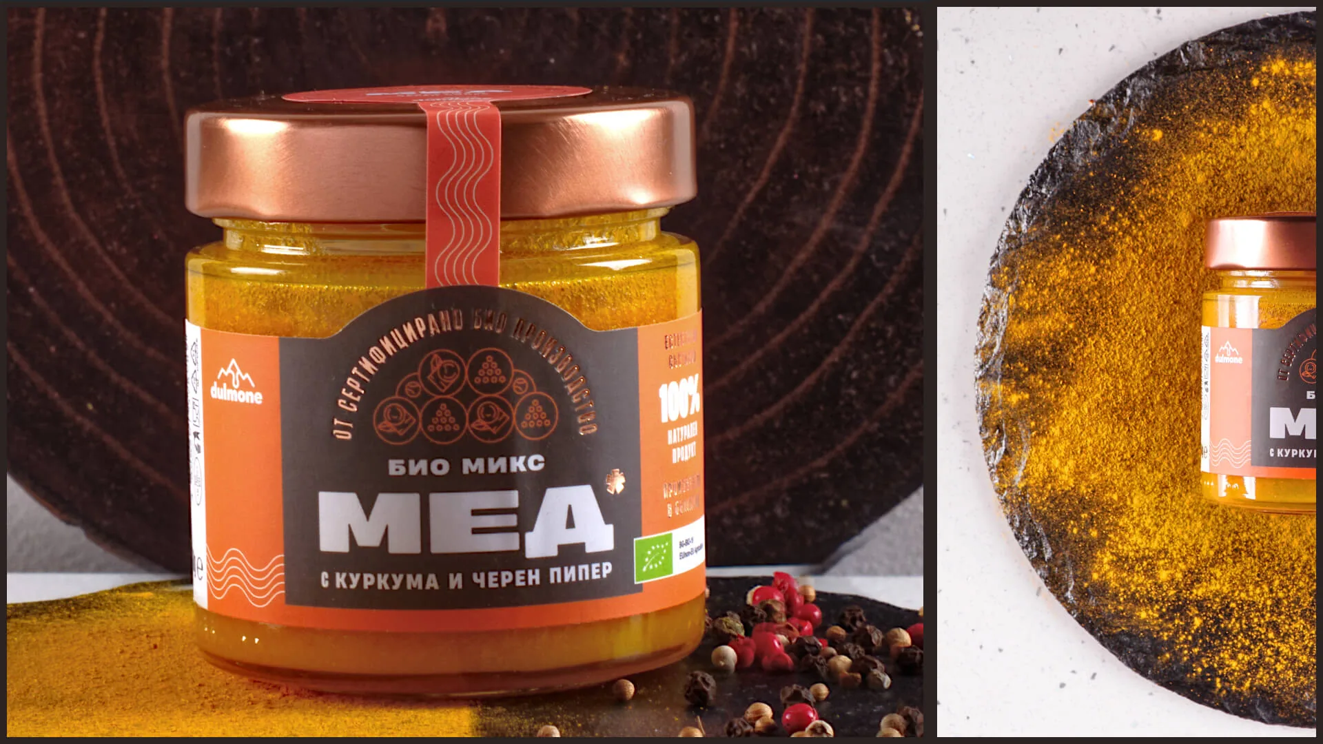
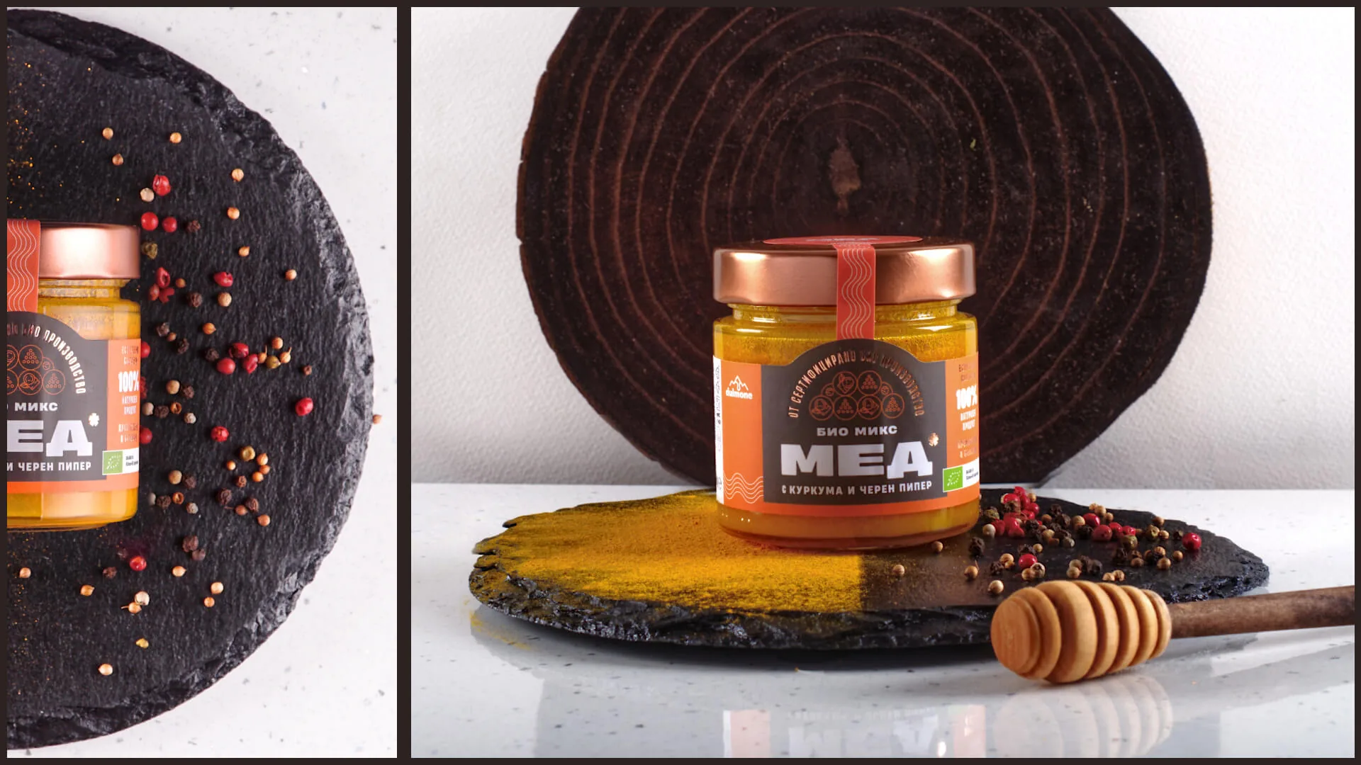
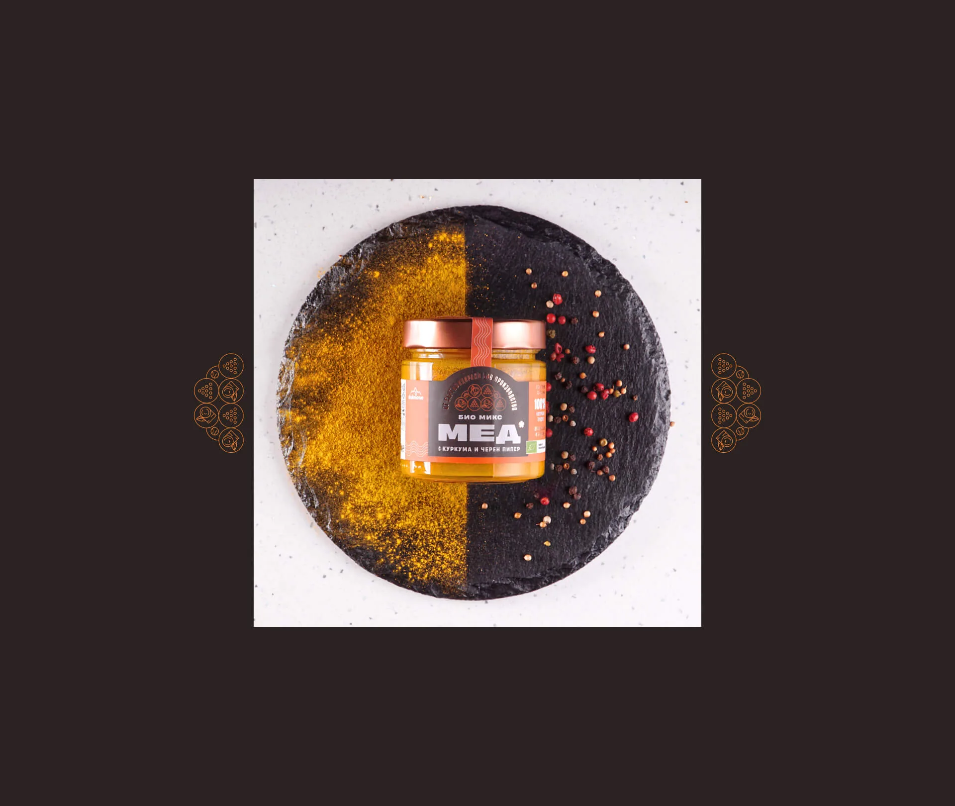
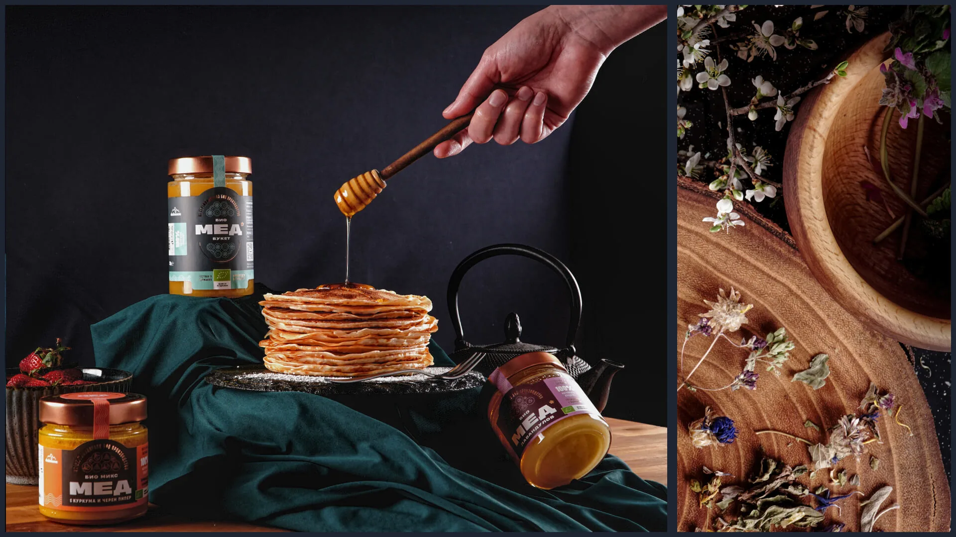
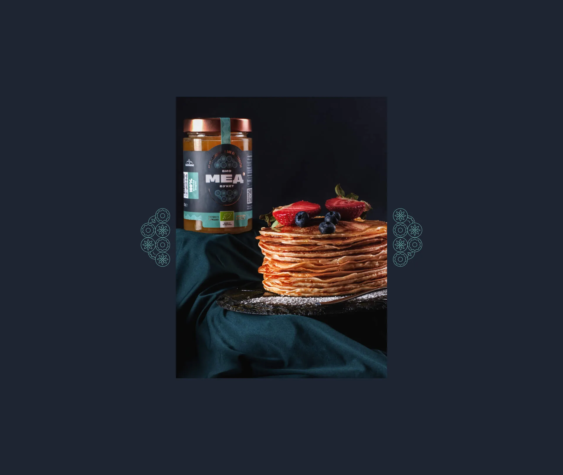
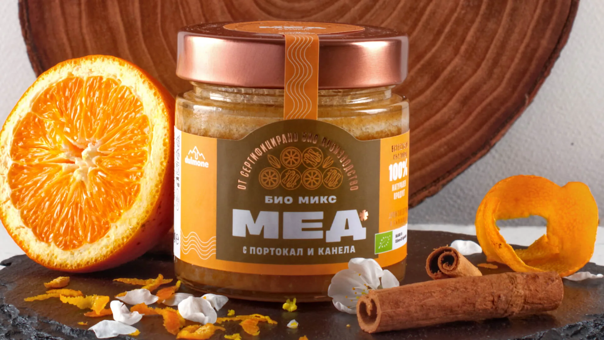
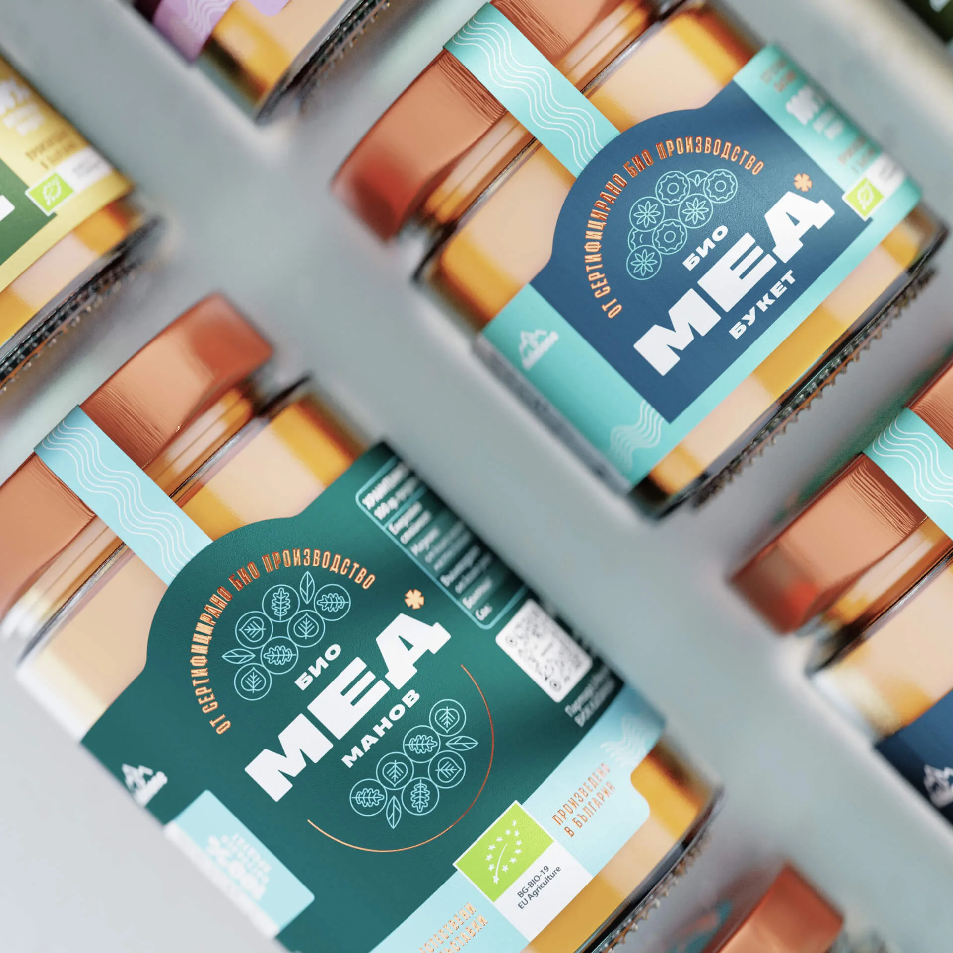
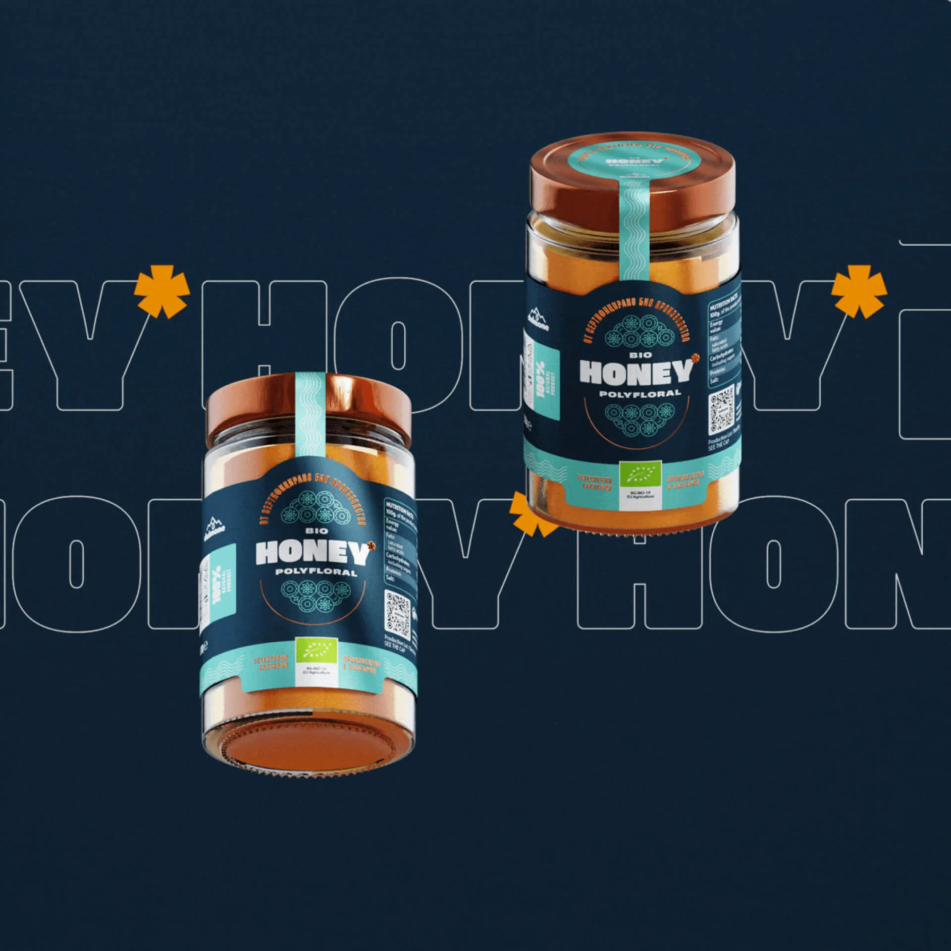
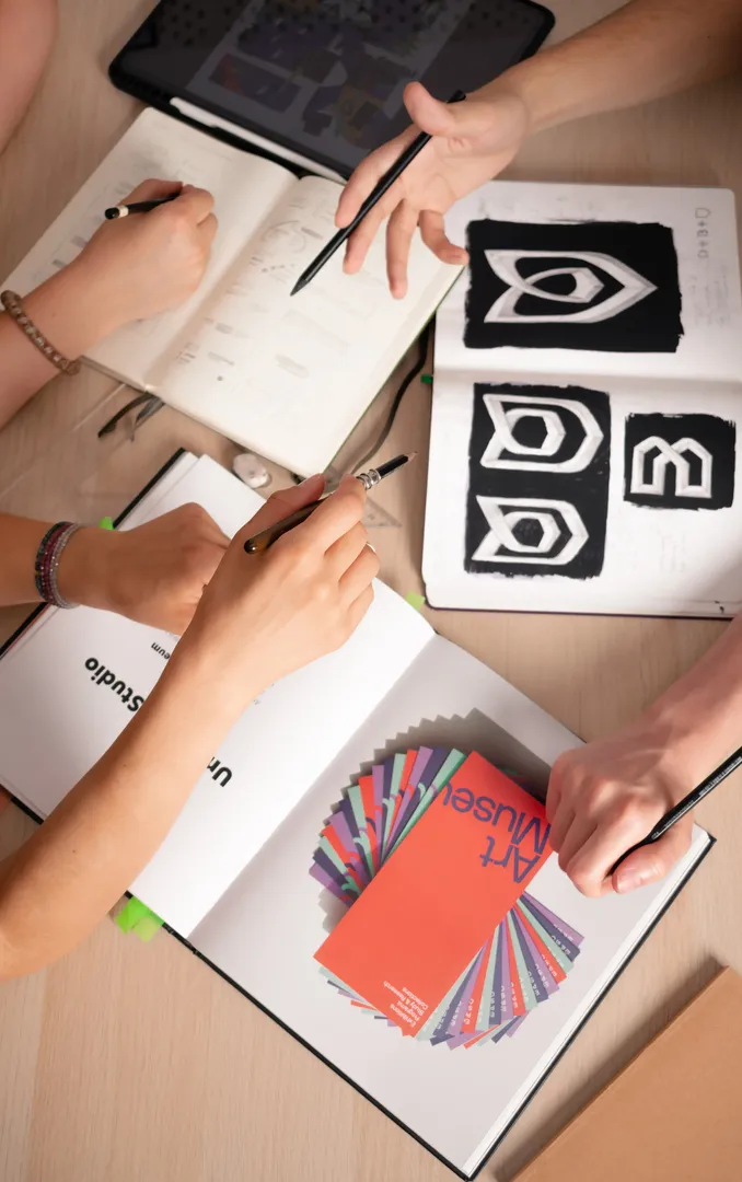
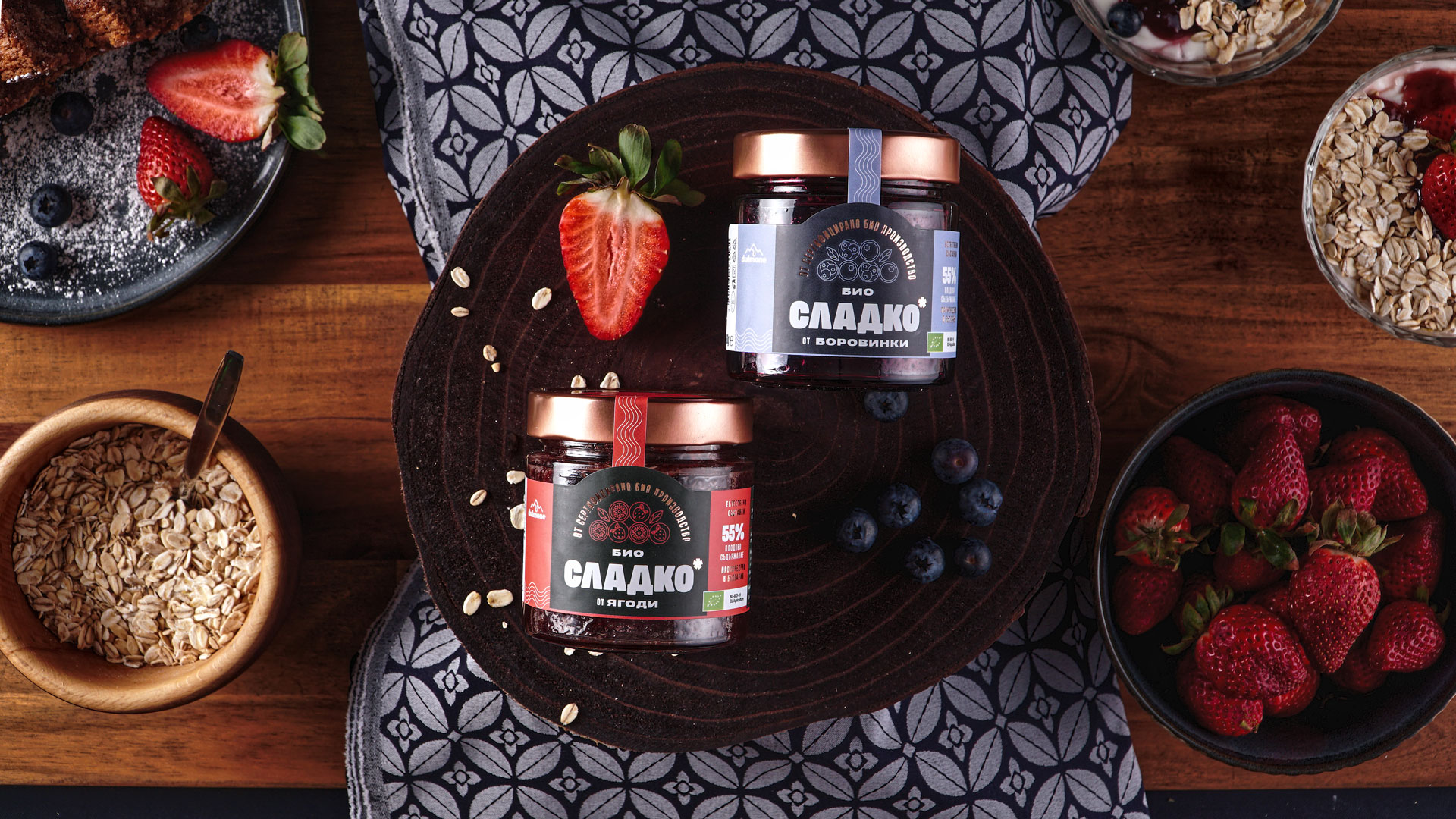
We developed a visual identity and packaging system with appetising photography and precise typography. The design draws a clear distinction between each flavour range while keeping the brand equally recognisable on the shelf.
TEAM
Art direction: Alexander Petrov · Lead designer: Radimira Yordanova · Design: Maria Vasileva, Selen Petkova · Print: Sira · Special thanks: Martin Mihaylov, Katrin Staneva
THE RESULT
The new packaging system reached the market and gave Dulmone a premium presence in chains such as Billa and Lidl. The system was planned from the outset for the range's further growth and development.
WORDS FROM THE CLIENT
At the guidance of Embrand studio we as a client got involved in the process early on, allowing us to gain the confidence we are moving in the right direction from the start. This lead us to a result without any compromises with the quality, while still maintaining within deadline.

Georgi Yanakiev — CEO @ BG Hive